


Boost Your Landing Page with the ARCTIC Model
August 28, 2025
When you're designing a landing page, you probably want to check it to make sure it's as optimal as it can be. That's why many designers use a model to rate their designs. Models contain guidelines on things your landing page should do well on to achieve as many conversions as possible.
There are tons of models out there, all with different variables and structures, and they all claim they're the go-to model.
However, most of those models are just never quite enough. Very often we'd find an issue that just doesn't fit into a category in our chosen model. Or sometimes the model we chose doesn't account for something we really wanted to check.
As designers, we've struggled with this a lot. That's why we decided to do something about it. Allow me to introduce you to our brand new, all-encompassing model:
ARCTIC
Using the best parts of other models and our years of experience in analysis and optimization, we build our own model!
This model, we proudly call ARCTIC.
But of course, making your own model means that it won't be common knowledge. So I figured I'd use this opportunity to lay out our model for you, so you know what aspects we judge landing pages on in our landing page submits and our expert reviews.
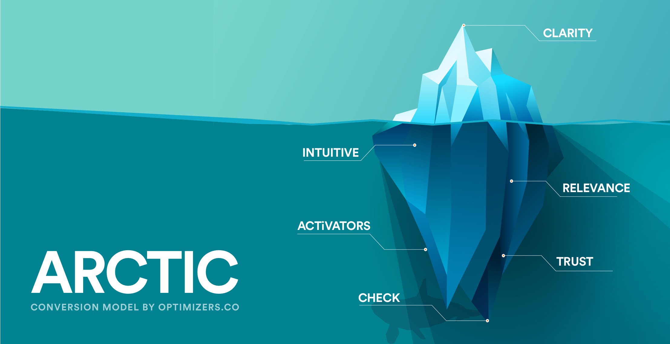
ARCTIC stands for Activators, Relevance, Clarity, Trust, Intuitiveness and Check. These six elements form the core of any landing page. All six elements need to be top-notch on your page in order to achieve as many conversions as possible. Otherwise your page will be as cold as...well, the arctic. So, what do those letters stand for? Well, it's quite simple.
A - is for Activators
Activators are an essential part of any landing page.
Nobody's going to sign up if there's nothing to activate them to do so.
You need to give users a reason to act now.
So what are activators? They are basically the elements on a site that activate the user's desire to buy or convert on a page (right now).
Obvious things like call-to-action buttons and forms fall under this, but everything else that directly or indirectly motivates users to buy does too. Think of things like strong headlines or USPs for example.
You can use well-known persuasion techniques like scarcity (only two left!), count-down timers (expires in x minutes) or adding the action-words (now, today, get) as well to activate your users to take action. See activators as the fuel to ignite your rocket :)


For example, take a look at these two buttons. Which of these do you think would get people to click the button faster? "Get Started" is a pretty generic and weak CTA.
"Get your free metrics" on the other hand is not only specific and clear about what you'll get, but it also throws in that it's free. Clearly the second button is doing a good job, while the first button could be a better activator if the text was stronger.
R is for Relevance
You may be familiar with this one. Relevance is the principle that everything on your landing page has to be relevant to your audience.
This isn't just about the content on the page, but also about how it's being presented.
People are selfish creatures. We don't care about the company behind the page, we don't even really care about the product. What we care about is how it will benefit us. Everything on the page should help steer to that point.

If you look at this paragraph, the text is focused on the product. That may look neat, but it takes the focus away from the customer. "That's neat, but what's in it for me?"
That's an issue with relevance, because while the message may be relevant for the customer, it isn't presented in such a way.
C is for Cookie- erm, I mean Clarity
The first C stands for Clarity. I'm sure some of you have already heard of this one too.
This one is basically that everything on the site has to be clear and visible. Nothing should be hidden or hard to find.
You can’t mention everything on your page either, so you should really think through what’s really important for your users. Less clutter = more sales.


Let's take headlines as an example, with two pages featured in our recent blog: Carrot and Iventlist.
Carrot's page prominently has the headline "Lead with Clarity". Ironically, that isn't very clear. What does this say about the product? What will this do for me? I have no idea.
Comparatively, this other headline from Iventlist is much more clear. There's no doubt what this will do for you. The lesson: Always be as clear and direct as you can. Any doubt your customer could have could be a reason for them to not convert.
T is for Trust
In order for anyone to buy something from you, they have to trust you first. And trust is something you have to earn.
Trust comes in many forms, from the information you ask from your customer to the general design of your site.
There are plenty of common mistakes when it comes to this. Some of the most common ones I see are:
Asking for information without explaining why you need it
Not utilising any form of authority or social proof
Noticeable spelling and grammatical errors in the copy
These may all seem small, but they could cost you a lot of conversions.
Remember though, just because you're not actively hurting your trust doesn't mean you've earned it.
For example, take a look at this page from the UK division of ING Wholesale Banking.
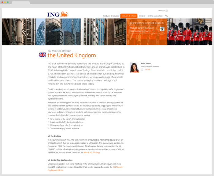
Granted, they list they've won an award and they show a person, which is good. But otherwise? This page is pretty much just text. I don't feel any trust, do you?
Your design has to build that trust. Show the guarantees you offer your customers. Show the companies that you work with or testimonials. And, above all, have a visually interesting, consistent and up-to-date design that reflects your company.
Compare that page to this part of a page of another bank called Monzo:
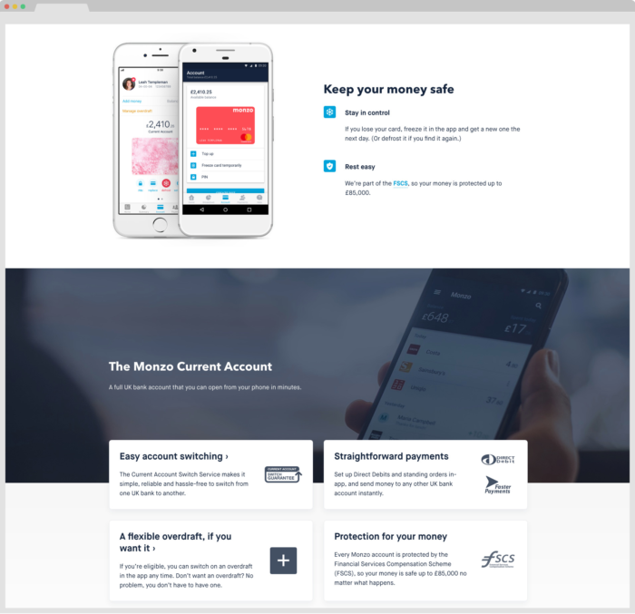
Isn't that so much better? They show logo's of other large companies. They prominently feature the protection their customers get.
Not to mention, the general design is much more modern, clear and professional. All of this helps Monzo clearly establish their trustworthiness.
The moral of the story: trust is something you have to earn. Make sure your site actively tries to earn it.
I is for Intuitiveness
This basically means your site has to be intuitive to use.
A phrase I like to use is "Be innovative, be unique, but don't reinvent the wheel". That's basically what this is. Every action on the page has to be immediately clear and understandable to any visitor.
For example, I've seen so many pages that have these fancy scroll effects, where one touch of the scroll wheel will send the page a full screen down.
Take a look on this page if you don't know what I mean, and try to scroll over it.
Obnoxious, isn't it? Because it isn't intuitive. I'm sure another site that uses that scrolling style already sprang to mind. Wouldn't it be so much easier to use if it just scrolled like a regular website?
That's intuitiveness; don't break the mold for the sake of breaking the mold. And this isn't just about scroll animations, this goes for every part of your website.
Always ask yourself "is this natural to use?". After all, if someone has trouble navigating the page, how do you expect them to convert?
The other C is for Check
And last, but definitely not least: check! Always be sure to check your page when you're done working.
Check the design, check the functionality, check the copy, just check everything one last time.
We recommend having someone else checking it for you too, just to iron out any mistakes you may have missed.
Just to give you an example: One of our clients discovered in his final check that he forgot to link his signup form to the database. Ouch!
This may seem like an obvious step, but you'll be shocked to hear how often we see people skipping it. Whenever you're done, just check your work. You'll be amazed what you may find.
ARCTIC; simple and efficient
Hopefully this little insight into ARCTIC gave you an idea of how we analyse landing pages. As long as your page is ARCTIC-ready, I'm sure you'll start raking in those conversions in no-time!
Want to be 100% sure that your page is ARCTIC-proof? Feel free to check out our expert landing page reviews! We'll take your page across every corner of the ARCTIC-iceberg to help you make sure every little thing is as optimal as it can be. Check it out here!