


We Analysed 10 Landing Pages - and Here’s What We Found
August 28, 2025
Perhaps some of you have already noticed, but recently we passed the amazing milestone of 500 landing pages featured on Landingfolio. On behalf of all of us here at Landingfolio, thank you so much for your support! We are incredibly proud and grateful Landingfolio managed to grow into what it is today, and we're already looking forward to the next 500 designs.
But we haven't just been doing our own thing over the past three years. We've been listening to your feedback, and today we're putting some of that feedback to action. Many of you have told us you'd like to see feedback on the designs we upload. Feedback about what a design does well, and what could be improved. Today, we're going to do just that! We have compiled 10 of our favourite recently featured designs, and provided some feedback on what they do well, and what could use some improving. Perhaps you'll find some improvements for your page as well! So, without further ado, let's get into it!
Note: These are in no particular order
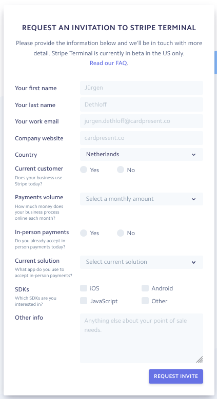
1. Stripe Terminal

Let's begin with Stripe Terminal. Stripe Terminal is a terminal system that allows you to easily set up customized physical payments with verified card readers, that works with the main Stripe tool.
What this page does well
Let's start with what this page does well. Overall, the design of this page is really solid! It gives off a fast, modern feel; exactly the vibe Stripe Terminal is going for. The background, with its slanted, colourful and sleek design feels quick, modern and a bit playful, and it does a wonderful job at separating the various page elements while simultaneously keeping the page visually interesting. The large drop shadows under the elements are a very popular current design trend that emphasize the elements they're under, and they work very well here, giving the page an even more dynamic feel. Great job in the design department!
What could be improved

Though, as solid as the design is, I think there's a lot of improvement to be made in communicating what exactly the product is. For the longest time I thought it was a physical payment terminal with tooling, then I thought it was only the tooling, and then after browsing around some other pages I came to the conclusion it's a physical terminal with tooling that's also compatible with other terminals. That is always a bad sign.
Be more clear
Even for a complicated or abstract product, or for a product that's an addition to another product like this, it should always quickly be made clear what it is. Granted, people familiar with Stripe may understand this page just fine, but what if a new visitor lands on this page? They'd probably be lost as to what the product is. Being specific is always a good thing; mention clearly and directly what you're getting. The description at the top of the page should be enough to make at least the core product clear, and this description did not do that for me.
Improve registration form
Also, to be blunt, the registration form is could be improved. It's long, it's cluttered and it looks very complicated. Most of the time long forms are a huge conversion-killer, and the many fields combined with all the descriptions under the form titles could make this form seem very off-putting. Forms should almost always be as short and easy as possible, and if they do have to be longer, cut it up in smaller, easier to process pieces.
Now I will say, there are certain demographics that prefer longer forms for certain products because it feels more secure, but this is the exception more than the rule. If you're not sure a longer form would benefit conversions: test it. If it doesn't, cut all the fields that aren't 100% necessary, and split up the form in multiple steps that appear as you fill it out to make it seem as easy to fill out as possible. You'll be surprised how large of an impact this can have.
So, to sum it up:
Overall design and background design express a modern and dynamic vibe perfectly
Drop shadows enhance dynamic feeling even more
Exact information about product is co2. mmunicated rather poorly
Long form is most likely a big conversion killer
2. Carrot
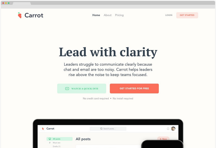
Carrot is not only one of my favourite vegetables, it's also a platform for leaders within teams and workgroups, which allows them to communicate clearly with their team without posts getting lost between the posts of the other team members.
What this page does well
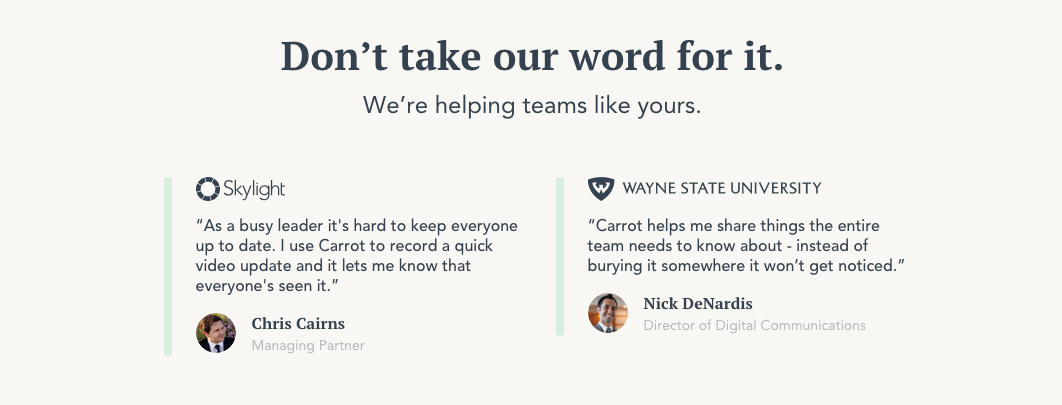
For one, they're clearly going for a formal and professional style, and they nailed it down well with the beige background and serif font. It feels very formal and tidy; feelings fitting for their demographic of leading figures. The CTA button is also clear and noticeable, and not only appears twice on the page but is also always stuck to the top of the page so you can always easily click it. And, they have user reviews, which is always a good thing.
What could be improved
Overall I think the design of this page is very solid, but that doesn't mean there aren't some improvements to be made. For one, when you land on the site, it's not immediately clear what the product is. It took me a while to figure out what this program was, while it should be at least somewhat clear as soon as you land on the page. Showing the platform in action using a gif or video could make the program a lot clearer quickly. They do have a demo video, but you have to access it via a button. Putting a muted, autoplaying version of that right on the page itself will draw a lot more people to it and could help a lot with explaining the product.
Slack integration?
The site also puts emphasis on Carrot's integration with Slack. But Slack is a chat program, and isn't one of the benefits of Carrot that it eliminates the noise from regular chat programs? It's not made clear enough what unique features Carrot offers and how they work with (and improve on) your communication via Slack. Because of this, it comes across as a bit contradictive.

Headline isn't clear enough
Finally, the headlines would be better if they were more specific. "Spark meaningful discussions", "Update your team in seconds", "Perfect for Slack teams" and even the main headline "Lead with clarity" are rather broad, and don't communicate the concrete features and benefits of Carrot. We also mentioned this in our blogpost about writing good headlines.
So, to summarize:
Style and atmosphere expressed well
Clear, noticeable CTA button
User reviews
Could do a better job at communicating the product more clearly
Conflicting messages, or unclear explanation of some messages (Slack integration?)
Headlines could be more specific
3. Fullstack HQ

Fullstack HQ is an allround web development company based in the Philippines. Their page definitely shows off their development skills, but do those skills translate into a good design?
What this page does well

Things start of well. The first thing people see on the page is some of the people working at Fullstack. This unique approach immediately establishes a personal connection, which creates a lot of engagement and trust right off the bat. Good job there! They also have a live chat feature on their landing page, which is a great and established method of increasing conversions by offering visitors an easy link to your company to quickly ask a question. And the headline, though perhaps a bit long, clearly and directly states what Fullstack does. "Increase efficiency and reduce development cost". Clear and straight to the point, as it should be.
What could be improved
However, there are still improvements to be made. To start, there may be a bit too much focus on the team. There are plenty of images of the team, but nothing that illustrates what the company actually does. Showing the employees prominently creates trust, yes, but that trust doesn't mean much if it's not clear what those people can do.

There is also no information about previous clients, previous projects, or anything of that nature on the page. Especially for agencies like these that kind of information is essential. Their work page shows they have some nice projects under their belt, and their about page has a bunch of reviews from clients. Use these and put them on your landing page.
Don't mess with my scroll!
But the worst problem has to be the scroll effects. The scroll effects could draw in the attention from the visitors and it may look cool, but on this page all the elements come in too slowly. If you're scrolling down the page you may end up with a completely blank screen before the content comes rolling in. This doesn't feel natural, and sometimes could mean people may scroll over an element before they can even see it. This page would be better off if the elements came in faster or even if the fade effects were removed completely. Remember: Always put function over form!

So, to sum it up:
The team members are featured prominently which builds trust
Live chat is always a good idea
Headline is clear and to-the-point
Not enough focus on what the company actually does
Little to no references to past clients and past work
Scroll effects are very obtrusive
4. Iventlist
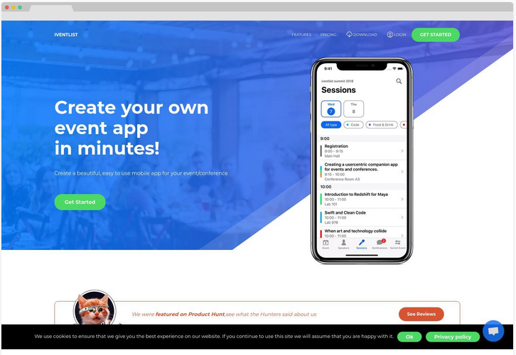
Iventlist is a service that allows you to easily create an app for an event, so attendees can easily gain access to the information they need. Definitely a clever idea, and with a solid site to back it up.
What this page does well
To start us off, the main headline is very clear and specific. "Create your own event app in minutes!" There is no doubt what this product will do for you. To-the-point, direct and clear; the way we like it!
A bit further down the page we find the interactive buttons that trigger different site screenshots. These are a great way to engage users and make them pay more attention to the screenshots in question. They serve as a form of gamification; drawing users in by making it fun, and they do it well.
All of the different page elements are well-divided too. Every new subject is set apart from the previous subject using gray or blue background elements. It may seem subtle or trivial, but it helps a lot in giving the page a natural structure.
What could be improved
As for improvements, for one, the Call-to-action "Get Started" is pretty weak, and on top of that the button itself is rather small and doesn't stand out a whole ton on the blue background. Making this button more prominent and the Call-to-action stronger could have a positive influence on conversions. For the call-to-action, I'd recommend making it more specific or more personal, and making use of the offers you have. For example: "Try it for free now!"
Improve social influence
When it comes to social proof, they have some examples of events that used their services which is good, but having testimonials from organisers of these events would be even better. Nothing beats the power of social proof. Heck, there are some reviews on Product Hunt, and they prominently reference Product Hunt on their site. But why redirect users to Product Hunt if you can also put some of that positive feedback directly on the page? If you have something you can use to draw your visitors in, don't send them to another page to see it. That only massively increases the chance they won't come back to the original page.

So, in summary:
Clear and specific headline
Interactive information buttons are engaging and fun
Very solid structure; page elements are well-divided and defined
The CTA is pretty weak
There could be more use of social proof, e.g. user reviews or testimonials
5. Plutio
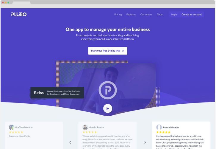
Plutio is an app to manage your entire business with, according to the headline. It aims to combine many necessary management tools, like task tracking and time tracking into one solid program.
What this page does well
This page directly opens with user reviews, all accompanied by stars. On one hand, this limits the page's ability to immediately establish what the product is, because it draws attention away from that information. But those golden stars do immediately establish a sense of trust, and frame whatever is on the rest of the page in a good light.

Building on the social proof, they also put a short testimonial directly under each selling point. This is a clever and unique approach to user reviews that immediately strengthens each of the selling points.
I'm also a fan of the mono coloured polkadot design. Surrounding the screenshots with colourful dots simultaneously helps emphasize the borders of the screenshots and gives the site a playful and fun atmosphere; clearly the feeling they're trying to go for judging by the user reviews they highlight. Good job!
What could be improved

But, despite this, I do still have some gripes. To start, the reviews are clickable. I understand this had to be done to fit the longer reviews in, but the way it's executed could be much improved on. The UI around the opened review makes it look like an image, the area where the text appears is very small which is uncomfortable to read, and you can only scroll the text down if your mouse is in this area. Otherwise, the actual page behind the review will scroll. This is unintuitive and can cause friction. I'd highly recommend at least increasing the size of the opened review window so scrolling needs to happen as little as possible, and it's a little more clear you actually have to scroll.
The CTA buttons could also be stronger.
Currently, they don't really stand out. A CTA button should draw the most attention on a page; users should always be drawn towards clicking that button. This white button on a page that is half white above the fold doesn't do that. (Though I do like they directly mention the free trial in the CTA. Much better than a bland "get started").
They also have eight additional features listed at the bottom, but they're just text. Why not put a little icon with all of them? This will immediately help clarify what the feature is about. People interpret visuals faster than text, making use of that wherever you can.
In summary:
User reviews are strongly put forward early on, framing the site in a good light
Short testimonials under each USP; unique and positively reinforcing
Colorful dots around screenshots are both fun and functional
Clickable reviews are confusing and poorly displayed
CTA buttons could be stronger
Listed features are all right, but would be much stronger with visual aids like icons
6. Crawly
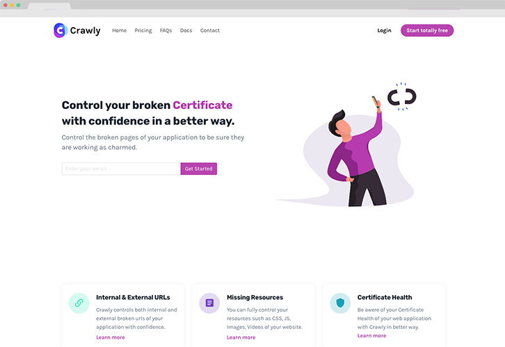
Crawly is a tool that scans your site for broken URLs, missing resources, certificate health and more. I gotta say, I love the name. But how does the site hold up?
What this page does well
Overall, this page has a really solid structure. There is plenty of different content, but it's all ordered and laid out in a logical way; headline with CTA, product info, product details, pricing, user review, FAQ, final CTA. Logical and tidy.
I'd also say this page gives a decent example of how to do entrance scroll animations right. A couple of images are animated and come flying in as you scroll down the page. These animations work because they happen as soon as the element appears at the bottom of the screen and they happen fast, drawing the attention of users to the element without making them wait for it. It's very easy to overdo scroll animations, but if you do want to use them, here's a good example of how to do it.
What could be improved
However, this page definitely could have benefitted from an extra round of checking. There's a noticeable amount of problems with the content. For example: the two reviews the page switches between are the same review from the same guy, when you select a yearly plan the text "monthly" doesn't change to "yearly", and there are numerous grammatical errors, spelling errors and odd word choices across the copy. These may seem like small problems, but they all create a sense of friction which negatively influences the user experience, and could ultimately result in a feeling of distrust. Always double-check your copy, and have someone else check it too. The most minor mistakes could have major consequences.


Apart from that, the illustration next to the headline at the top of the page does not immediately make it clear what this product does. The guy with his phone in the air reminds me of bad reception or something like that, not of broken links. I'd recommend changing the illustration to something that more directly represents the problem or the solution. Perhaps a computer screen with a faces with Xs for eyes? At least something that can directly relate to the idea of "site doesn't work".
So, to sum it up:
Structure and page content are solid
Scroll animations are implemented well
Some small but noticeable technical problems with some elements
Noticeable spelling and grammatical errors
Illustration at the top of the page isn't clear enough
7. ProfitWell Engagement

ProfitWell Engagement is an analytics tool that aims to give you deeper insight into your visitors. But what deeper insights can we get into their landing page?
What this page does well
To start, there is a quite strong CTA here; "Get your free metrics". It's clear, specific and to-the-point, and "free" is always a good thing. This is how you draw people in!

I like the illustration above the fold a lot too. Rather than show a full-page screenshot, they show some simple singled-out graphs, clearly illustrating the function of the program. And the questions asked by the person show what this product can be used for; it's an analytics program to track the visitors on your site and analyze their data. Not to mention, the animation draws your attention to it, automatically making sure you process the information it's trying to get across, while being subtle enough to not be annoying or counterproductive. Good going with this one!
What could be improved
On the other side, I suppose this is as a good of a time as any to mention this very common mistake. ProfitWell has logos of companies on their site. This is good, but they don't say what these logos mean. Are these companies that use your product? Companies whose product you use? Companies you've worked for? Companies that work for you? Without a line of text stating what these logos mean, they lose some of their value. Adding a simple line of text saying something like "Trusted by:", "Some of our clients:", "Used by over x companies, including:", etc. clears up what these logos mean and strengthens the effect of the social proof.
Apart from that, the headlines on the different USPs could also be better. Currently they are talking about "product", which may look cool, but it weakens the point you're trying to make. If it's not directly about the product or, even better, the visitor reading it, it's interpreted as less important and less relevant to the product. Plus, as we mentioned before, clarity is key. Lines like "Keep close track of daily user activity" may not sound as cool as "Product is sweating every customer that isn't using your product that should be", but it's definitely a lot more clear.
So, in summary:
The CTA is specific and direct
The illustration at the top of the page communicates the product and purpose very well
Company logos listed without explanation of what they mean
Headlines are not clear and direct enough; they don't talk about the product or the customer
8. Eagle
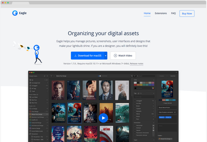
Eagle is a design library software that will help you store all your design assets in one convenient place. Quite a neat product, but if you’re going to target designers you’d better have the web design to back it up. So, does Eagle have it?
What this page does well

To start, I like the CTA button here. It stands out from the rest of the page and immediately draws you to it. But what I really like about this one is that it automatically sets to the version fit for you based on your OS, making the process of getting Eagle just that bit more fluent.
The video of the software in action is a fantastic addition too. It immediately shows what Eagle is about and what you can do with it. You couldn't make it more clear, not to mention the mere fact it moves means people will pay more active attention to it. Granted, Eagle is software that more easily allows this kind of presentation (this wouldn't work as well with, say, software for complicated mathematics for example). But that doesn't change it's implemented well here.
What could be improved
As good as the top video of the program is though, there may be one too many animations. Literally every single screenshot is animated, which can become a bit overwhelming and cluttered as you go down the page. Not only that, but repeated animation doesn't hold interest. People will be drawn in by the first animated screenshot they see, but once they've seen the first one they'll be less interested in the second one, and even less in the third.
Sometimes it's OK to show certain functionalities off with static screenshots to give people's eyes some rest, especially if you've already shown an animated screenshot before. This keeps up variety and makes the animated one stand out more, while simultaneously allowing users to focus on the text next to the lower screenshots and allowing them to interpret the screenshots at their own pace.
So, to sum it up:
The CTA draws attention, and adapts to the visitor's needs
The video of the software at the top immediately shows off the product, and engages visitors
Every screenshot is animated, which causes it to lose its impact
9. Kapa99

Kapa99 is a graphic design service, which their colourful, fun website clearly supports.
What this page does well
The overall style of the page is quite pleasant. It's playful, cheery, upbeat and fun. This goes both for the illustrations and the background design. It sets a pleasant mood, and also gives visitors an idea of the tone and style of work they can expect from this possible business partner.
The content is really solid too, and all the information that needs to be on the page is on the page. Signup CTA, USPs, explanation of how it works, list of products you can get with the service, samples of previous work, pricing, user testimonials, it's all here and mostly done quite well.
What could be improved
However, I do have to say the overall design feels crowded. All the page elements are right below each other, with little to no white space above and below the separate parts of the page. This makes the page seem cluttered, and it makes it hard to browse through the content on the page because everything seems to blend together. And the background does little to distinguish the various segments too.
White space gives a page the structure it needs, allows elements to stand out from each other, and gives visitors a moment of rest between various elements. Imagine a news article without paragraphs; it'd be unpleasant to read. The same goes for landing pages. Keep that in mind, and create space between different subjects and page elements to ensure the page is pleasant to look over.

So, our final comments:
The overall style is upbeat and fun, and sets a good mood while communicating the company's culture
All the content that needs to be on the page is there, and it's of good quality
The design is crowded due to a huge lack of white space and functional background elements
10. History Search

And last but not least for October, History Search. I think the title should make it evident what this product does: it allows you to easily search through your browser history.
What this page does well
To start, the animated example of the tool is, once again, utilised perfectly here. It gives users a clear and interesting look at what the product does. And since it’s a white tool on a green background it naturally allows the tool to stand out too, without a fake screen border or other effect having to be forced around it.
What could be improved
An interesting choice in my opinion are the use cases. Rather than listing simple USPs like most sites, History Search have opted to display some of the benefits of using their tool using use cases in the form of videos. On one hand, it’s a unique approach, and I suppose it is possible some of the demographics they’re aiming for may enjoy it. However, I have a feeling it would be better if they removed these videos and just quickly showed off their USPs in text and illustration forms. I am doubtful people are actually taking the time to click on these videos and watch them to see how the product can help them. If they haven’t tested the effectiveness of these videos compared to regular text-based USPs, I highly recommend they do.

Also, in my opinion, the two illustrations of the apparent mascot feel out of place; particularly the one with the animated search history around it. These illustrations give off an informal, personal and somewhat playful vibe. That's fine of course if that's what you're going for, but the minimalist, mono coloured and strictly aligned design of the rest of the page does not express this feeling nearly as well.

Formal or informal?
By comparison, the rest of the page feels a lot more formal, product-focused and almost business-centric. Again, this is not a bad thing, if you're consistent with it. If you want to be informal and playful, experiment more with colour gradients, background elements behind different page elements, use the illustrations more, et cetera. If you're going for a more professional vibe, drop the illustrations or change them to fit a professional tone better. Most of all: be consistent.
So, our final comments:
Animated example of tool perfectly shows off the product
Video use cases may not be strong enough motivators
The illustrations of the mascot feel out of place compared to the rest of the site
Conclusion
And that about wraps it up! I honestly quite like this selection of pages! I feel like a lot of these pages have tried a unique approach which often had potential, but they just haven’t always managed to perfect it. When you’re looking over your design, always try to ask yourself the question “How would my customers react to this?”. And another free tip: ask others to take a look at your design, preferably someone from the demographic you’re targeting that hasn’t seen it before. Let them browse over it and give feedback with a fresh eye. You never know what you may learn.
I hope you found some useful tips in this list! If you’d like to learn more about writing effective headlines (since I did mention those a few times), we’ve got another blog about that available right here. Also, do you want to make sure your landing page is as good as it can be? We now offer specialised landing page reviews! You’ll get a full review of your landing page with at least 50+ actionable and specific tips to help you make your landing page as great as it can be. Feel free to check it out right here.